
The new table does not look perfectly coordinated. It looks collected: one floral language, three colourways, and enough contrast to make every place setting feel intentional.
For years, table linen was sold as a matching exercise. A tablecloth matched the napkin. The napkin matched the placemat. The runner behaved. Everything belonged to one set, which made buying easy but often made the table feel strangely flat.
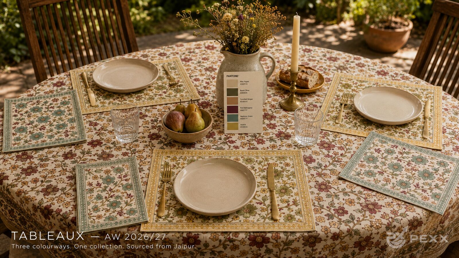
AW 2026/27 is moving in a more interesting direction: layered tables. Not messy tables. Not maximalist tables. Layered tables, where the cloth, placemat, napkin, border, and plate each do a different job.
That shift matters for home textile buyers because table linen sits at a rare intersection. It has to photograph well, sell as a collection, feel special for hosting, and still look believable on an ordinary dining table. A matching set can do one or two of those things. A layered system can do all four.
What Is a Layered Table?
A layered table is a setting where the linen pieces are related but not identical. The tablecloth may carry the main floral repeat. The placemat may frame the plate with a border. The napkin may introduce the stronger accent colour. The pieces belong together because the palette, motif scale, and border logic are shared, not because every surface repeats the same print in the same way.
This is why the approach works so well for hand block printed table linen. Block print already has natural rhythm: vine, flower, bud, border, ground. A layered table lets each part of that rhythm breathe.
Why Matching Sets Are Starting to Feel Dated
Matching sets are tidy, but they can make pattern disappear. When the same floral appears across tablecloth, placemat, napkin, and runner, the eye has nowhere to rest. The table becomes one continuous field. From a distance, the craft is there, but the composition becomes noise.
Layering solves this by assigning roles:
- The tablecloth creates atmosphere and covers the largest surface.
- The placemat frames the setting and gives each guest a defined space.
- The napkin adds movement, softness, and a small colour accent.
- The border gives the table a finished edge without needing extra styling.
- The plate creates a pause in the pattern so the print can be read.
For AW 2026/27, this matters because interiors are becoming warmer and more collected. Buyers are not only looking for a print; they are looking for a table story that can move from a garden lunch to a winter dinner without feeling seasonal in the obvious way.
The Palette Behind the Shift
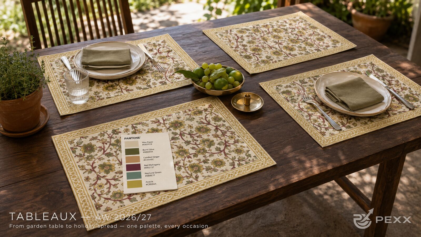
The Tableaux AW 2026/27 palette uses warm, grounded shades rather than high-contrast novelty colour. The story begins with Wax Paper, a soft neutral ground that keeps the linen calm. Burnt Olive carries the foliage. Candied Ginger brings warmth into the smaller flowers and border details. Red Mahogany adds depth without becoming bright red. Neptune Green cools the palette, and Acacia gives the collection a dry golden note.
The important thing is not only the colours themselves. It is the way they allow several pieces to sit together. A Neptune Green placemat can work with a warmer tablecloth. An Acacia border can lift an otherwise muted setting. A Red Mahogany floral can make the table feel festive without becoming holiday-specific.
| Palette Role | Shade | How It Works on the Table |
|---|---|---|
| Ground | Wax Paper | Keeps the print light enough for everyday dining and lets ceramic plates stand out. |
| Foliage | Burnt Olive | Adds botanical structure without the brightness of spring green. |
| Warmth | Candied Ginger | Softens the floral repeat and gives the setting a sun-warmed tone. |
| Depth | Red Mahogany | Creates contrast in the flower without pushing the collection into festive red. |
| Cool Balance | Neptune Green | Prevents the palette from becoming too warm and helps placemats read clearly. |
| Accent | Acacia | Works beautifully in borders, giving the table a quiet golden finish. |
Why Placemats Are Becoming the Key Piece
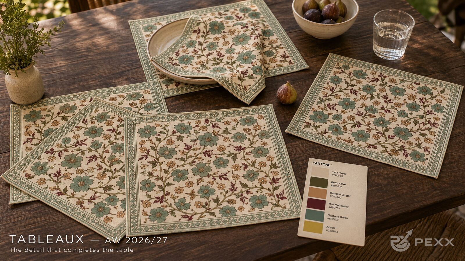
If the tablecloth creates the room mood, the placemat creates the individual moment. It frames the plate, protects the table, and gives the buyer a lower-commitment way into pattern. This is especially useful for export collections because placemats are easier to style across apartment dining, outdoor tables, restaurant settings, and holiday gifting.
The best placemats in this direction do not simply shrink a tablecloth print. They use border, scale, and empty space more deliberately. A placemat has to look complete even when a plate covers the center. That makes border design important, because the edge remains visible throughout the meal.
How to Style a Layered Table Without Making It Busy
The easiest rule is to keep one large surface dominant and let the other pieces support it. If the tablecloth is floral, choose placemats with a strong border and a calmer center. If the placemat carries the floral, use a quieter napkin. If the napkin is printed, let the plate be plain.
In practical terms:
- Use plain ceramic plates to create visual breathing room.
- Repeat one colour across two pieces, not every piece.
- Let borders do the formal work instead of adding too many table accessories.
- Choose brass, wood, glass, or stoneware rather than highly polished decorative props.
- Keep flowers and fruit tonal so they support the linen rather than compete with it.
This is the difference between a table that looks styled for a photograph and a table that looks ready for people.
What This Means for AW 2026/27 Buyers
The commercial opportunity is not just a new print. It is a more flexible product architecture. A buyer can range a full tablecloth for impact, placemats for everyday use, napkins for gifting, and runners for smaller dining formats, all within one visual world.
That also makes the collection easier to merchandise online. The customer does not have to buy the entire set to understand the story. Each piece can stand alone, while the full table still feels richer when the pieces are layered together.
For AW 2026/27 table linen, the winning table is not perfectly matched. It is deliberately related: one palette, multiple surfaces, and just enough variation to make the setting feel collected.
Quick Answers
Should table linen match?
Table linen does not need to match exactly. A more current approach is to coordinate pieces through palette, motif, and border language while varying the scale or colourway across tablecloths, placemats, runners, and napkins.
Are placemats still in style?
Yes. Placemats are becoming more important because they offer a flexible way to bring pattern to the table without committing to a full tablecloth. They also frame each place setting and work well for everyday dining.
What colours work for AW 2026/27 table linen?
Warm neutrals, olive greens, muted reds, dry golds, and softened blue-greens are especially useful for AW 2026/27 table linen because they feel seasonal without being overly festive.