

How six considered colours — sourced from Pantone NYFW and WGSN x Coloro — solve the oldest problem in floral block print: the motif that disappears into itself.
There is a mistake that ruins more floral block prints than any registration fault or uneven dye bath. It is quieter than those. It happens at the design stage, before a single block touches cloth.
All-same-family tones.
Warm ground, warm flower, warm stem — everything blends into a pleasant, unremarkable haze. The motif is there. But it does not speak. It does not travel across the cloth the way a well-resolved print does, pulling the eye from flower to leaf to bud and back again.
For the AW 2026/27 home collection — bedcovers, quilts, and cushions — we have built a palette that solves this problem deliberately. Six colours. One structural logic. Every shade sourced from Pantone NYFW AW26/27 and WGSN x Coloro AW26/27.
The Six Shades
| Shade | Hex | Source | Role |
|---|---|---|---|
| Wax Paper | #E8DFC8 |
WGSN x Coloro 035-88-12 | The ground. The palest tone — slightly warm but essentially neutral. Its job is restraint: to hold without competing. |
| Cocoa Powder | #5C2E1A |
WGSN x Coloro 008-35-06 | The anchor. Deep red-brown — the primary motif fill. Its depth makes the print visible from across a room. |
| Arabian Spice / Toffee | #A0714F |
Pantone AW26 Seasonless | The mid-tone. Carries secondary flowers, inner petal rings, and border lines. The transition between deep fill and pale ground. |
| Red Mahogany | #6B2737 |
Pantone NYFW AW26 Key Colour | The warm accent. Sits inside petals as fine inner detail — a second-pass impression that adds dimension without adding noise. |
| Burnt Olive | #6B6B3A |
Pantone NYFW AW26 Key Colour | The foliage tone. Earthy and dry enough to read as living plant material, muted enough not to fight the florals for attention. |
| Fresh Purple | #7B5EA7 |
WGSN x Coloro 136-32-33 | The contrast. Bridges warm and cool — breaks the warmth just enough that individual flowers read as distinct from one another. |
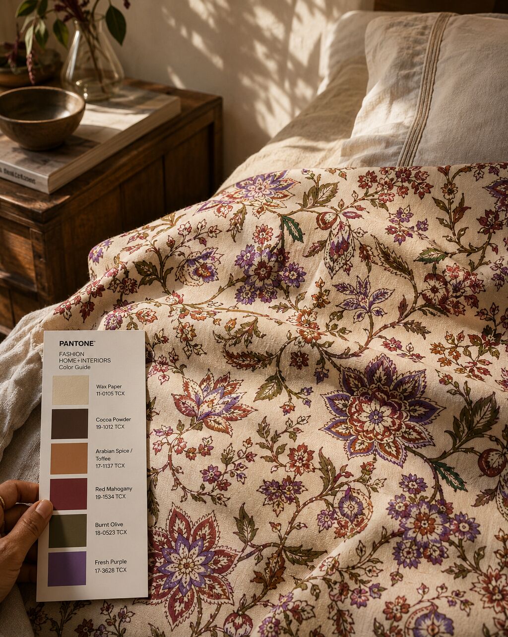
Fresh Purple — The Critical Call
Cocoa, Toffee, and Mahogany are all warm red-brown family. Burnt Olive is earthy. Left as a five-colour palette, the set is harmonious — but the florals risk reading flat at distance. One colour is needed that sits on the opposite side of warmth without becoming jarring.
Fresh Purple is not a cold contrast like cobalt. It bridges the warm and the cool — it breaks the warmth just enough that individual flowers read as distinct from one another. One in every three or four flowers, or scattered as a bud across the repeat, it creates the visual rhythm that makes the eye travel.
It is also the colour of natural indigo, one of the oldest dye traditions in Rajasthan. It belongs here — not as a trend addition, but as a cultural anchor. WGSN explicitly identifies Fresh Purple as a key AW26/27 accent for interiors and textile applications.
How These Six Work Together: A Sanganeri Repeat, Resolved
Imagine the classic Sanganeri floral repeat — the one with the large central bloom, the curved vine, the small scattered bud.
- Wax Paper — the ground, the fabric itself
- Cocoa Powder — the main flower fill, printed first, the heaviest impression
- Burnt Olive — all leaves, all stems, the vine that connects the repeat
- Toffee — secondary flowers, smaller blooms, inner petal rings
- Red Mahogany — the fine detail pass: dots, border lines, the centre of each bloom
- Fresh Purple — one in three large flowers, or the small scattered bud — the rhythm note
Six colours. Three passes minimum. One print that reads at arm's length and holds at close range.
Why This Palette Now
AW 2026/27 home interiors are moving toward what the industry is calling cocooning warmth — interiors that feel insulated, layered, considered. Not maximalist. Not minimal. The textiles that are winning in this cycle are the ones that look like they have always been in the room: prints that are warm but not loud, complex but not busy.
This palette delivers that. The depth is there — Cocoa and Mahogany give the print weight. The warmth is there — Toffee and Burnt Olive make it liveable. The contrast is calibrated — Fresh Purple keeps it readable without making it fashionable in the wrong way.
It is the kind of palette that works in a Jaipur haveli and in a London bedroom with painted shutters. That is the commercial test for a hand block print in today's wholesale market: it has to travel.
A Note on How We Source Colour
Each shade in this palette is traceable to a verified trend authority — Pantone's NYFW AW26/27 runway report and WGSN's Coloro AW26/27 seasonal forecast. We work from primary sources because colour direction for export collections needs to hold for 12–18 months. A shade that is trending on Instagram in June may not be the shade a European buyer is sourcing for February delivery.
These six are structurally sound. They will not date before the collection ships.
PEXX crafts hand block printed textiles for considered living. All prints are produced in Rajasthan using traditional carved teak blocks and natural-process dyes. Enquiries for AW 2026/27 home collections open now.